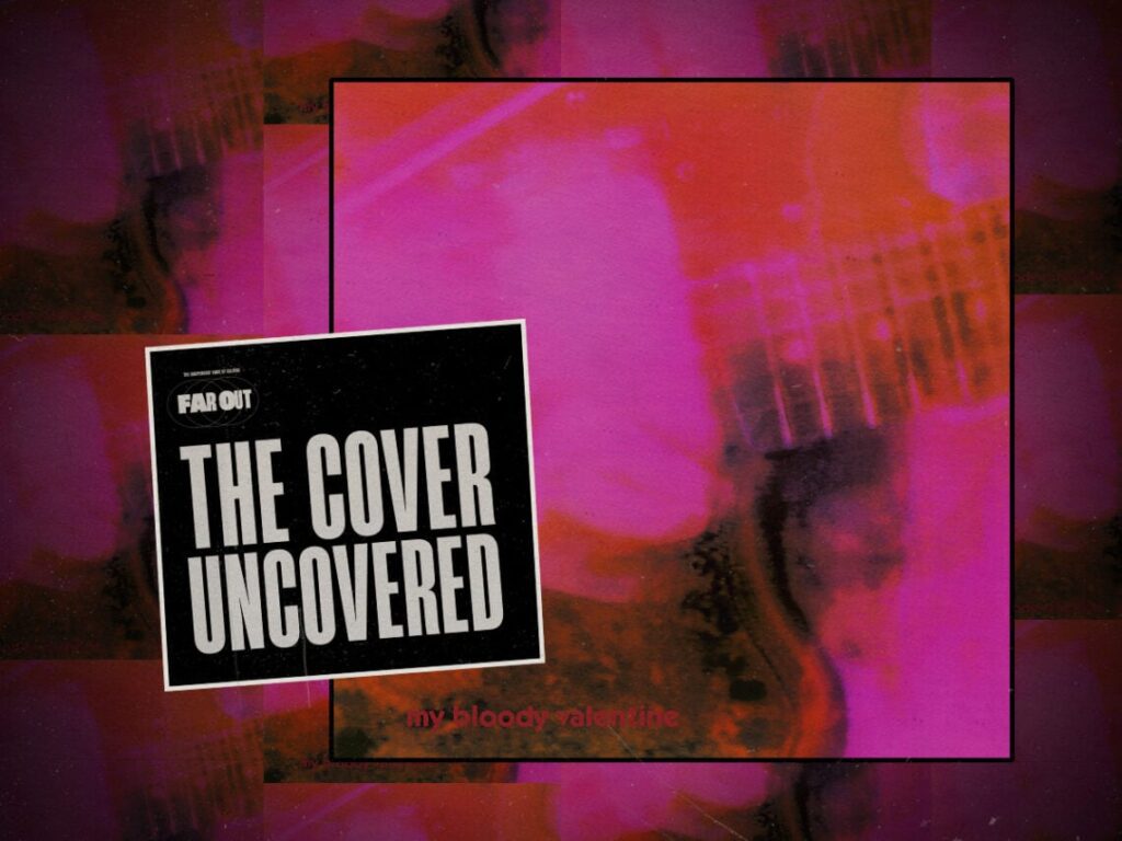
The Cover Uncovered: The culturally inspiring artwork for ‘Loveless’
 Posted On
(Credits: Far Out / Album Cover)
It’s difficult for a disarmingly abstract record cover to stick in collective memory, but when the image perfectly captures the album’s essence, it may just inspire visionary film directors and fashion brands for decades to come.
The last full album by My Bloody Valentine, Loveless, set the bar for the shoegazing wave that the band had participated in pioneering. It’s a colourful patchwork of samples that lures its listeners into a distorted haze, bridging the gap between alternative rock and house hip-hop. The experimental ‘glide’ guitar technique at its heart was a core contribution to the genre, and its mastery by Kevin Shields provides much of the texture and depth of the album.
Capturing his strings mid-strum was visual artist Angus Cameron’s idea for a cover. Fans believe the centrality of the guitar may have been due to the common association of the Fender Jaguar and the genre, since a lot of shoegaze artists similarly sought its reverb-evoking features and often used the same instrument. Much like the guitar sounds on the album, the image is hard to make out, as it blends into the whole and provides little context beyond the promise of a trance-like listening experience.
Cameron’s idea was put together, inspired by a screen-grab from the video for ‘Too Shallow’ he directed with the band, adding blurring effects and pop art colour. The band’s name is nearly invisible, hidden in a corner with little colour difference from its backdrop, as if the guitar was the band’s real and only story; like the vocals on Loveless, the band’s name blends into the guitar.
Aside from abstract signifiers, the very punk colour play identifies a key ingredient in Loveless, which is its experimental glazed rock. Shields himself audaciously declared, “No other band played that guitar like me”, despite his self-conviction being the cause for the label to drop My Bloody Valentine following the album’s release.
The simplicity of the cover might also have been synonymous with the need to keep it simple, since the long-term commitment that was Loveless’ creation brought the band’s label to the brink of bankruptcy.
Creation Records’ second in command, Dick Green, reportedly had his hair turn grey overnight because of the strenuous collaboration, with recordings spread in 19 studios all over London over nearly two years of production. Although it was later hailed as a masterpiece, it was one of the costliest albums in the history of rock, and its debut sales didn’t begin to compensate for its expenses, only getting to 24 in the UK charts.
Portraying the guitar as the album’s protagonist was quite foreshadowing on Cameron’s part. The controlling nature of Shields’s leadership brought him to his own unravelling, since he buckled under the pressure he had imposed on himself to make a follow-up album to match Loveless’s success.
The songwriter’s passive-aggressive behaviour, which led to their former record exec Alan McGee to have a personal meltdown, also prevented them from having label representation, which quickly led the band to break up. The exemplary album cover, which became a beacon of inspiration for fashion houses like Supreme, stands as an emblem of shoegazing and the band’s grand last effort.